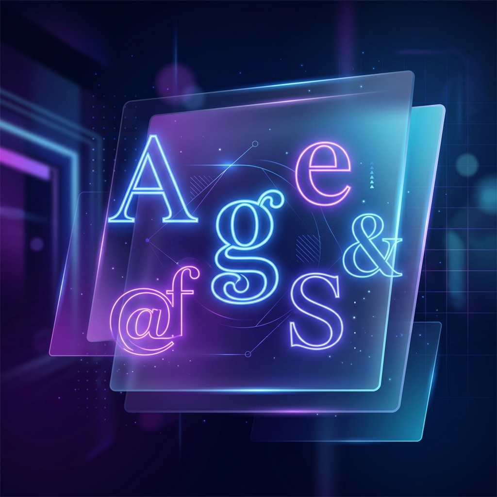
Typography does not just convey text; it sets the tone, defines brand personality, and impacts readability. In 2026, web design trends demand highly clean, expressive, and readable layouts, with an emphasis on variable weight systems and load time optimization. Selecting the right font can make the difference between a cluttered, basic-looking site and a premium digital experience.
Google Fonts remains the premier destination for web-safe typography, offering a massive collection of high-quality fonts that are free to use. Based on a survey of leading digital designers, here are the top 5 Google Fonts for websites in 2026.
1. Inter: The Defacto UI/UX Gold Standard
Designed specifically for computer screens, Inter is an exceptionally clean, neo-grotesque sans-serif. In 2026, Inter continues to dominate digital product design and dashboard interfaces. It features tall x-heights, highly distinct character shapes (preventing confusion between 'I', 'l', and '1'), and a comprehensive variable font package.
- Best For: Body text, UI components, control panels, and data-dense dashboards.
- Key Benefit: Incredible readability even at very small sizes (10px–12px).
- Design Tip: Pair it with a classic serif headline for a beautiful editorial contrast.
2. Plus Jakarta Sans: Sleek, Modern, and Friendly
Plus Jakarta Sans is a gorgeous geometric sans-serif that blends corporate professionalism with a soft, friendly charm. Its smooth, open counters and subtle curves make it extremely popular among modern B2B SaaS landing pages and creative agency websites.
- Best For: SaaS landing pages, marketing sites, and technology brand portals.
- Key Benefit: Excellent weight distribution that looks incredibly premium in bold and semi-bold weights.
- Design Tip: Use it at 18px–20px with light tracking for body copy to feel spacious and premium.
3. Outfit: Geometric Perfection
Outfit is a stunning, highly geometric typeface that draws inspiration from premium fonts like Circular and Futura. With perfectly circular round letters and sharp, minimalist details, it is the perfect choice for headers, large display text, and tech-forward branding.
- Best For: Large headlines, hero section displays, and minimalist brand layouts.
- Key Benefit: Delivers a clean, premium, high-fashion aesthetic without cost.
- Design Tip: Use Outfit in Extra Bold for headlines, and pair it with Inter for body text.
4. Sora: Bold, Quirky, and Tech-Forward
If you want to inject personality and a slightly futuristic vibe into your website, Sora is a brilliant choice. Commissioned for digital environments, its square-ish proportions, unique terminal endings, and bold visual structure make it stand out instantly in creative, Web3, and AI-centric spaces.
- Best For: Creative portfolios, technology startups, and editorial content headers.
- Key Benefit: Highly memorable, distinct character that breaks the monotony of generic sans-serifs.
- Design Tip: Use it selectively for headings and key call-outs rather than long-form body text.
5. Playfair Display: Classic Serif Elegance
Not every digital experience is sans-serif. In 2026, designers frequently use Playfair Display to bring elegance, drama, and authority to web designs. Inspired by late 18th-century European typography, it is a high-contrast serif typeface that behaves beautifully in editorial layouts, luxury e-commerce, and digital publications.
- Best For: Luxury brands, editorial articles, hero quotes, and fashion banners.
- Key Benefit: High-contrast stroke weights that create a luxurious, premium feel.
- Design Tip: Always set Playfair Display in larger sizes (24px+) to keep the thin strokes readable and crisp.
Typography is the clothing that words wear. Choose the outfit that fits your product's soul.- SecretUXD
Best Practices for Web Typography in 2026
No matter which Google Fonts you select, follow these rules to ensure high-end results:
- Use Variable Fonts: Instead of loading multiple individual font files (Light, Regular, Bold, etc.), use the single variable font file to reduce server requests and improve page load speed.
- Limit Font Families: Never load more than two font families on a single website. Mixing too many styles degrades visual cohesion and slows down the site.
- Establish a Hierarchy: Ensure you have a clear font scale (e.g., standard major third ratio) and keep line heights proportional (usually 1.5 to 1.6 for body copy and 1.2 for headings).
Conclusion
Typography plays a silent but pivotal role in user engagement and brand perception. By using versatile, modern fonts like Inter, Plus Jakarta Sans, Outfit, Sora, or Playfair Display, you build a solid visual foundation that enhances usability and elevates the overall quality of your digital experience.